fatdog - 2008-12-09 14:03
Why, oh why do marketing executives like to fvck up a good thing? Coca-Cola has had the same logo for well over a 100 years. The folks at Pepsi, my soft drink preference, can't seem to find their arse from a hole in the ground when it comes to good ideas.


Take a look at their new logo:

Who thought this was a good thing? My 8 year old daughter could have come up with a better design. Some twit messed around with Adobe Illustrator and got paid hundreds of thousands of dollars. Makes me ill just thinking about it.

I like how someone made it into an asscrack:

The Pepsi "Coinslot" logo.... nice...

With the economy as it is they come up with a new logo.They have way too much time on there hands I thinks.Next thing you hear will be the amount of employees they're slashing to cover the cost for a 2 minute logo.
It is estimated that Pepsi paid about 1 million+ dollars to Omicom's Arnell Group to work for five months on the logo. Five months?!? They spent five months and 1 million dollars making a logo that would take about five minutes to make.
Apparently, the same company is redesigning Sierra Mist and Mountain Dew. Mountain Dew will be renamed "Mtn Dew". Are they trying to reach today's semi-illiterate youth by using "txt tlk"?
Total cost of this new logo roll-out will amount to $1.2 billion.
Interesting background info, Fatdog. Thanks!
It seems to have worked for Walmart, so why not? Simpler, friendlier, more memorable. Pepsi's current cans are kind of cluttered.

masterblaster84 - 2008-12-09 14:42
Damn! They actually paid somebody money to tweak the original logo to something Fuglier?
Kind of reminds me when Coke tried to change the formula and taste more like Pepsi, it didn't work and Coke wisely dropped new formula.
that`s good advertising!
...everybody talks about that!!!

quote:
Originally posted by nelsongf9696:
With the economy as it is they come up with a new logo.They have way too much time on there hands I thinks.Next thing you hear will be the amount of employees they're slashing to cover the cost for a 2 minute logo.
this is so true very selfish of these companies no regard for human life when these hard working people have to put food on their table..this just makes the economy worse at this time of age...to me before they fire, they should just cut the pay or no raises for the time being...at least they stay with a job! just my 2 cents
i do not drink pepsi so if they go bankrupt thats fine by me.
New Coke was successful. It made people realize how much Pepsi sucks! (Hey remember Pepsi Clear? That was freaky stuff!)
"Mtn Dew"....
it was only a matter of time before everything gets modified to text format... (lol)

BTW I could see it coming when McDonalds became "Micky Dee's" That was a sign of the 'end of times' as I recall...
I like it. Much cleaner and better-defined than the old label, which recently was rotating with different artists' designs. Too busy.

I see a smile in the new Pepsi "cap" logo, which I like a little better than a straight white band. Kind of reminds me of the swoosh Coke added to its design a few years ago.
A new modern Logo belongs in a modern house...

Ya, looks like they made it look more modern....And Pepsi did lay a few thousand people off - just a few weeks ago - haven't you all heard? They've shut down some plants as well....
Here's something interesting (sort of)...
The new smile/buttcrack/swoosh on Diet Pepsi is thinner than on regular Pepsi. Subliminal or what?

Oh... and it's bigger on Pepsi Max. Makes sense.
Why? Why? It was fine before.... lets storm the factories and burn 'em to the ground... okay a little melodramatic

As long as they don't do like Coke and do a NEW Coke.... That bummed me out for.... minutes
Johnny
The ass crack is hilarious! When they came up with this were they watching Cartman's backside on "South Park"?
Lets all protest and not buy Pepsi anymore. One Million dollars for that, I bet those laid off employees are pissed off.
i dont drink soda anyway....too much sugar...
Well, to be fair - a lot of companies change their logos now days. Somebody already mentioned Walmart, and also AT&T recently. Also Pioneer several years back (and I'm still pissed off about that)

quote:
Originally posted by vladi123456:
Well, to be fair - a lot of companies change their logos now days.
Yeah. Coke changes the design of its cans almost every year (not counting the special Christmas editions).
Then there's K-Mart...


I'm more upset with the new Pepsi font than the logo.. I hate it when companies just copy a font that's suddenly seen as trendy instead of putting some actual thought into it, no wonder they change it so often, never give it the chance to become 'classic'. Sorry.. I've got a bit of a fetish for fonts.
I don't understand what their new logo is supposed to mean.. should just go back to this.
Then they can have their commercials with dudes sporting big mustaches on pennyfarthings being all extreme and cool.
Rock On.
quote:
Originally posted by Gluecifer:
I've got a bit of a fetish for fonts.
And I have a thing for logos. Used to play "name the company" back in school by showing logos without (or with blacked-out) names. It was a real crowd-pleaser.
Surprising how much corporate identity is tied up in a simple logo.
I even won a contest once naming record companies by identifying their "spinning (like on a turntable: blurry!) logos." Got about 20 free record albums from a Chicago newspaper for that one.
I agree that companies try to find and use fonts that are trendy. Makes them look "with it," which is the way a soft drink company would want to be perceived. A maker of "old-fashioned cookies" might not feel the same way.
quote:
I don't understand what their new logo is supposed to mean.
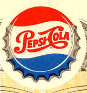
I'm no graphic artist, but I'll bet you a dollar that the red, white and blue Pepsi "circle" (especially the new one, which has gone back to 2D after being 3D for a while) is simply a stylized Pepsi bottle cap. As you show, Pepsi has been known by the design of its bottle cap for a long, long time.
quote:
Originally posted by ford93:
...I bet those laid off employees are pissed off.
This is a wonderful example of a rumour mill (news + conjecture + opinion > rumour > unsubstantiated info becomes fact
)
Is there any confirmation of the layoffs?
On a similar "what-a-stunning-waste-of-money-when-there-is-none"topic...As far as I recall - Pepsi laid off about 3,000 people a couple of months ago...
el.rojo.grande - 2008-12-12 16:23
So I guess the logo represents all the angry workers mooning corporate bigwigs (heehee)
a new logo?Come on guys,it's CHANGE!...and everyone knows that all CHANGE is good!
What? No one remebers the Cool Cans?

I'd love for the design to come back. If I blew my nose and glued the Kleenex to the new cans, it would actually be an improvement.

I still don't understand why everyone is so upset over the new Pepsi design. It's uncluttered, and the solid blue stands in stark contrast to Coke's red, making Pepsi instantly identifiable on a store shelf or in a cooler, even from a distance, which I imagine was one of the goals of the graphic artist(s) who came up with the design.
Besides, in business, change is good... and necessary. Businesses that don't change with the times and with tastes risk extinction. Just think of Schlitz Beer, Kenny Rogers Roasters, Comp USA, Teaberry Gum... and General Motors!
But... for those of you who still wish Pepsi cans would never change, here's Pepsi's first can (circa 1969)...

...and here's a modern can that celebrates Pepsi's original design, along with the various slogans, fonts and trademarks that have been associated with Pepsi over the years...

My favorite slogan:
"for those who think young" with a jingle sung by '60's sweetie, Joanie Sommers...

And, of course, there's
Britney's recent retro version.masterblaster84 - 2008-12-15 08:55
Baby boomer I think part of the joke here is that they spent millions to have somebody take there current logo and just change the lines a little. I don't think the whole rip is about changing the logo because your right they do have to change every so often.
I do Petey!
Ive got all of them still! And about 100+ other rare, one off, or foreign Coke and Pepsi cans!
Most unopenned.
Id gladly trade them all for a BBX!
Hey, does anyone remember 7UP Gold? My gosh I couldnt get enough of that stuff back around 1991...
Sort of cinamon flavor!
I still have one upopenned too!
Fellow can collector!!! How ya doin'?!? (Unfortunately, most of mine are open.)
We need to compare notes sometime. I don't have a 7-Up gold, but do have a Citrus 7-Up.
quote:
Originally posted by MasterBlaster84:
Baby boomer I think part of the joke here is that they spent millions to have somebody take there current logo and just change the lines a little.
Yeah. I probably should've been a graphic artist. I'd be rich. Unfortunately, I don't even have enough talent to twist a few lines.
My wife knows a girl who recently graduated from Michigan State in product packaging (it's actually a degree program). She designs shampoo bottles for Unilever... and is doing very well, thank you!
masterblaster84 - 2008-12-15 10:13
quote:
Originally posted by baby boomer:
My wife knows a girl who recently graduated from Michigan State in product packaging (it's actually a degree program). She designs shampoo bottles for Unilever... and is doing very well, thank you!
Funny but there is a lot of money in the marketing and advertising side of selling products.
they should of had it been a contest. were the winner got 20 grand. They could of came up with something better and saved money.